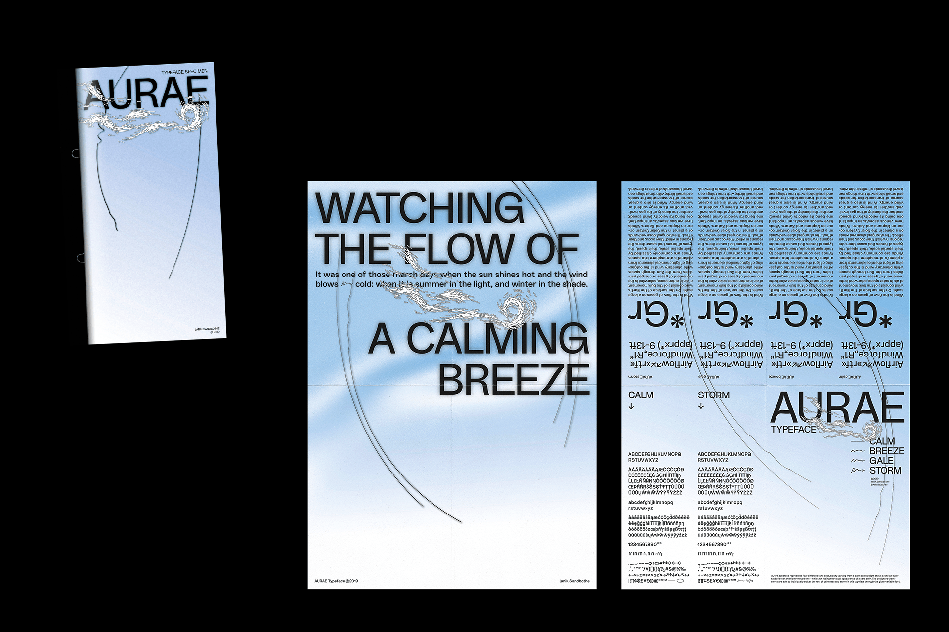
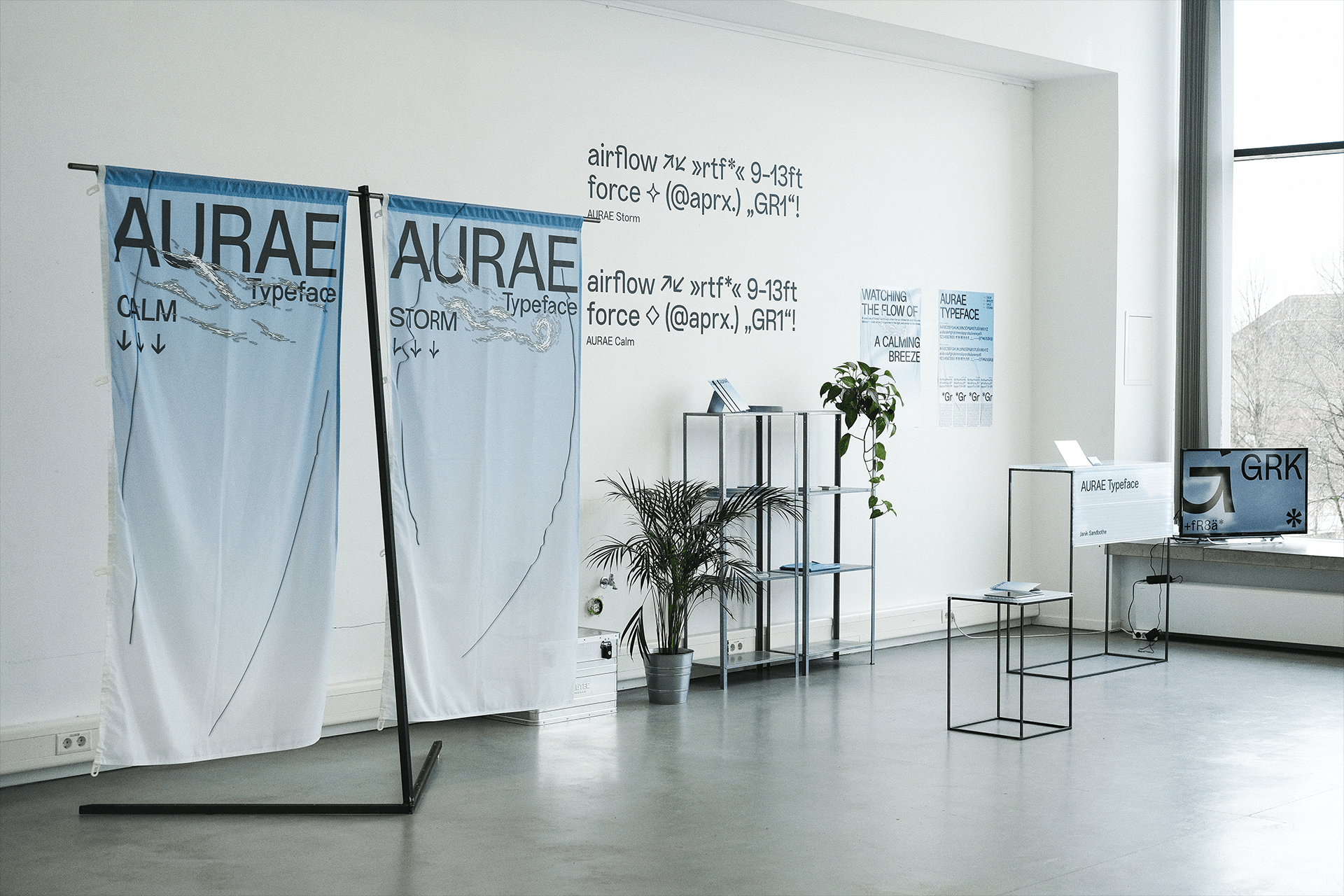
AURAE has the courage to combine the two rival worlds of functionalism and extravagance in one display typeface. This Typeface comes with two stylistic expressions: one with the greatest possible straightness and plainness and another with contrasting stroke widths and extravagant swings. Because of the variable font format, the designer is able to choose exactly how much functionalism and how much extravagance their sans serif typeface should be equipped with. As a result, the end product is a perfectly individualised, adapted font. AURAE finds its inspiration in the characteristics of the wind. It contains a motionless silence, a slight movement, as well as the unpredictable eruption of stormy gusts.
available
sans serif
2019
by Janik Sandbothe

